« Every Chick tract is a proven soul winner » — Jack Thomas Chick (1924-2016)
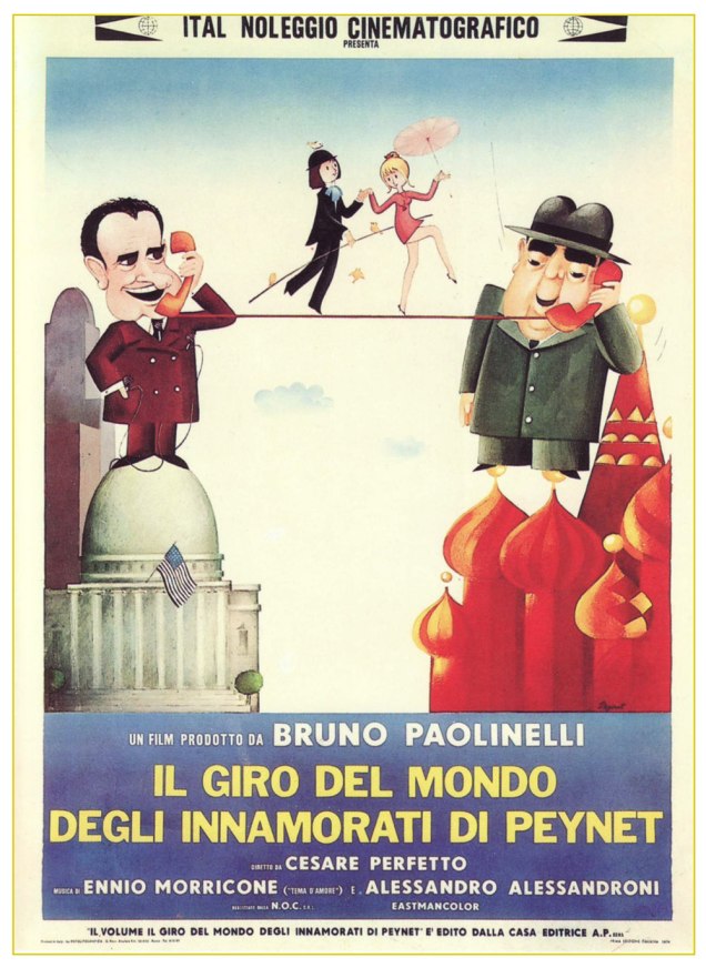
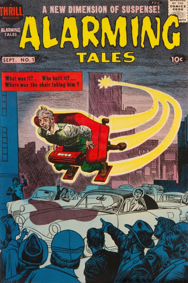
Before we begin, one must advance past the primordial question: « Who the 𖦹!!!**! is Jack T. Chick? » This simple query has been answered at length elsewhere, so I refer you to the heavy lifting done by others, notably this comprehensive obituary, or Joe McCulloch’s eye-opening article, Life Is Worth Living, both from the pages of The Comics Journal.
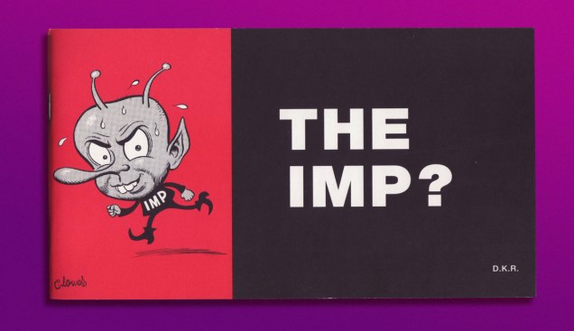
Then, of course, since we are ever standing on the shoulders of giants, there’s Daniel Raeburn‘s likely definitive Chick monograph, published in 1998 and today commanding usurious prices on eBay. Ah, but the author, as gracious as he is erudite, lets visitors to his website download The Imp absolutely free of charge. Go for it!
In 2016, upon Chick’s shuffling off this mortal coil, Raeburn was interviewed on the CBC’s As It Happens show*. He was asked « Now that he has died, what would you say is his legacy? » [ full interview here ]
Raeburn: « I think he did influence our culture. He influenced the counter-culture. I think particularly in the world of underground comics, I think he was the ultimate outsider. He was the most underground of all the underground cartoonists and I think there is a certain amount of grudging respect for him in that regard. He got his work out there with no help from anybody and he did it his way. He had a real DIY aesthetic. He’s sort of like a punk rocker except that he’s not a punk rocker. He was a Christian. But he did embody the punk, do-it-yourself ethos and I think that will be his lasting legacy — that and camp. I mean his comics have long-lasting camp value. They are unintentionally hilarious. »
And it is in this roundabout way that we arrive at today’s subject. Not Chick tracts per se, but a gloriously blasphemous parody thereof.
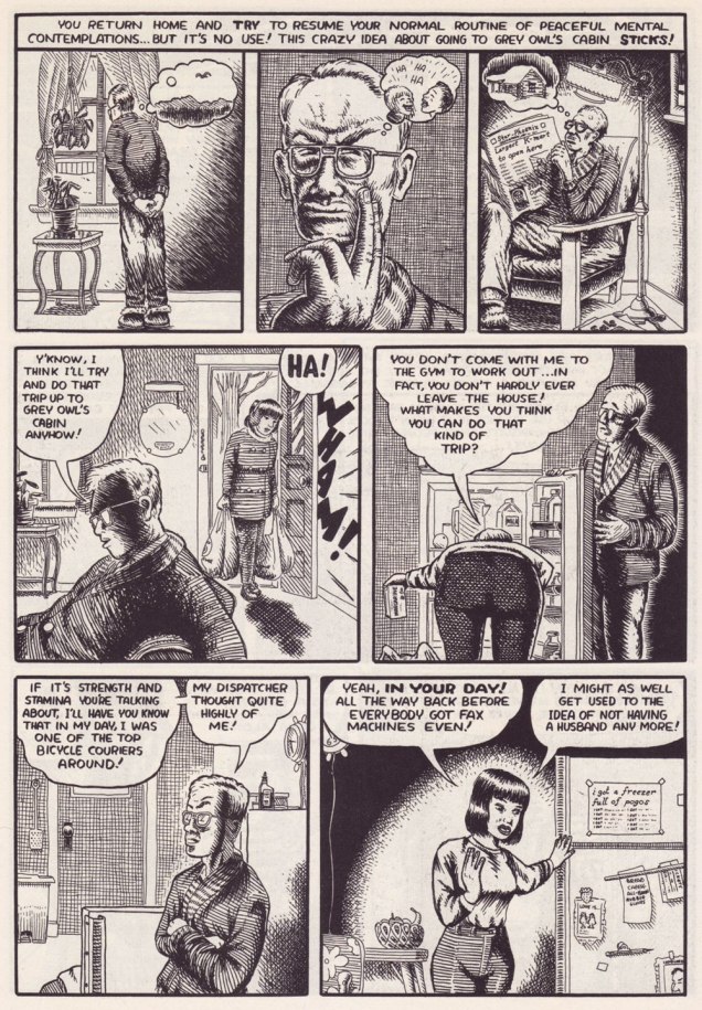
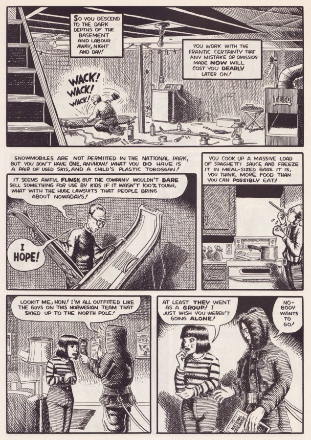
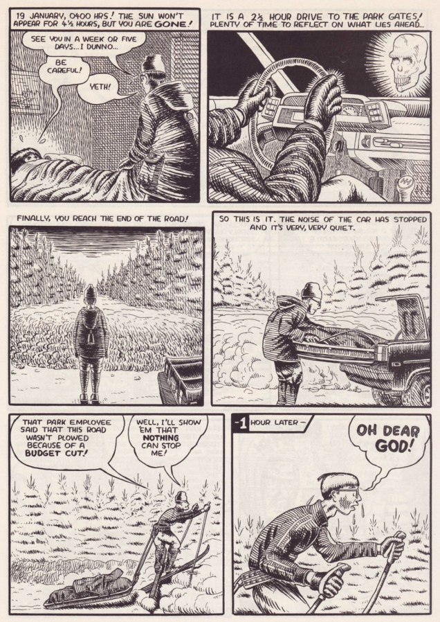
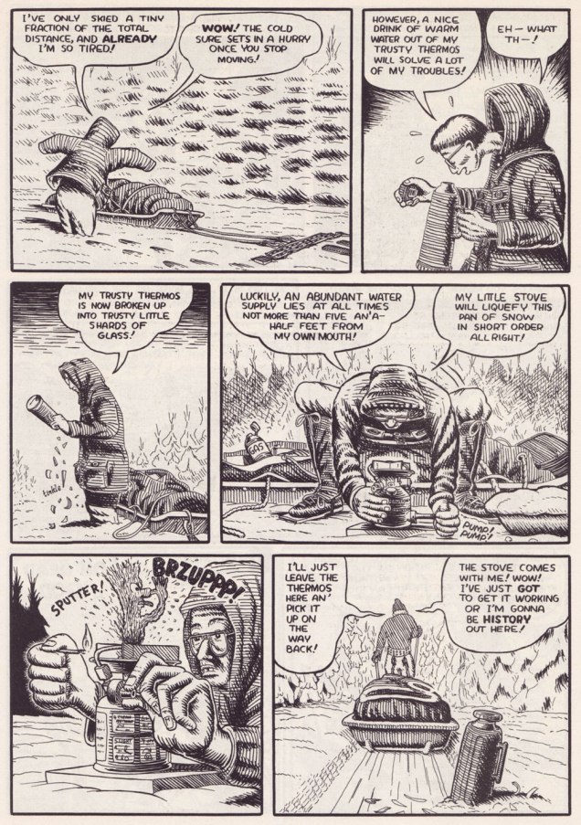
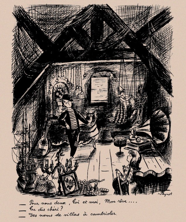
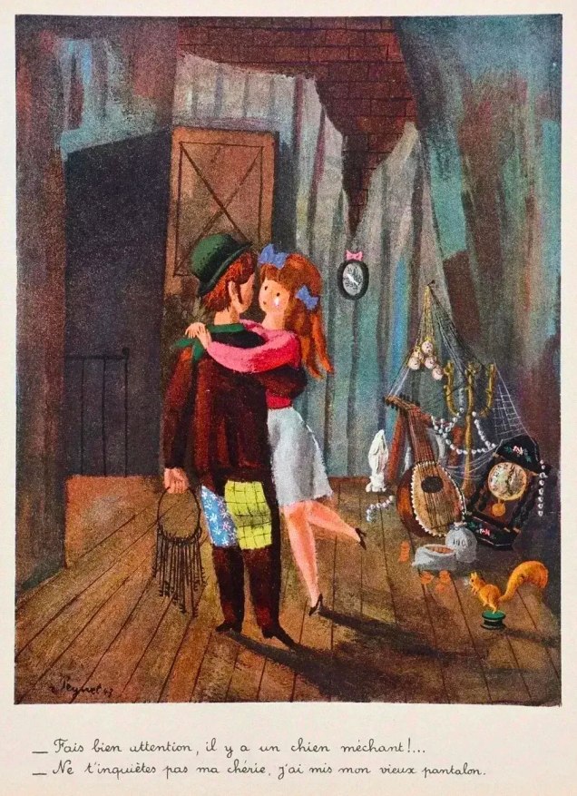
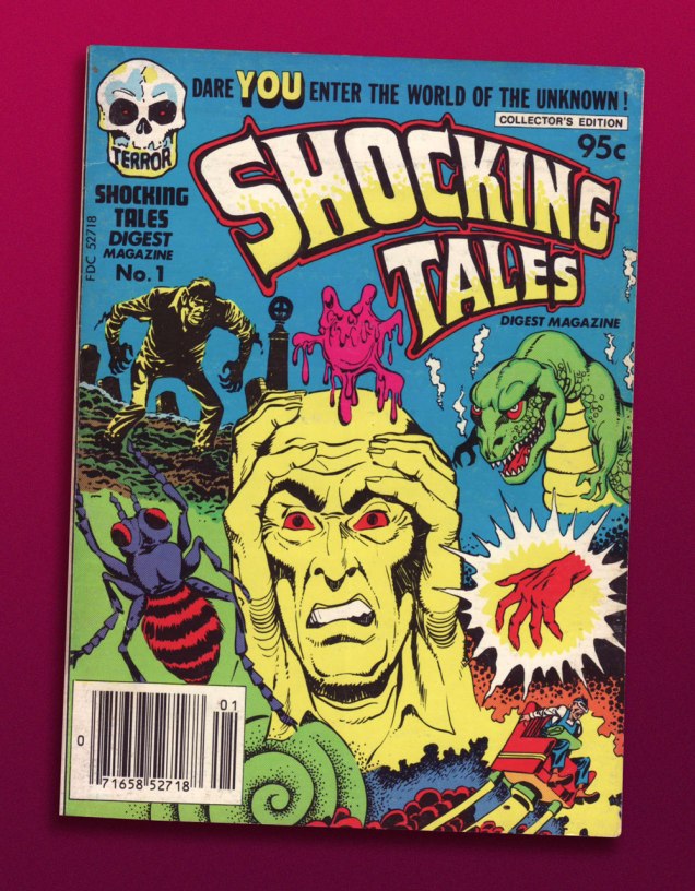
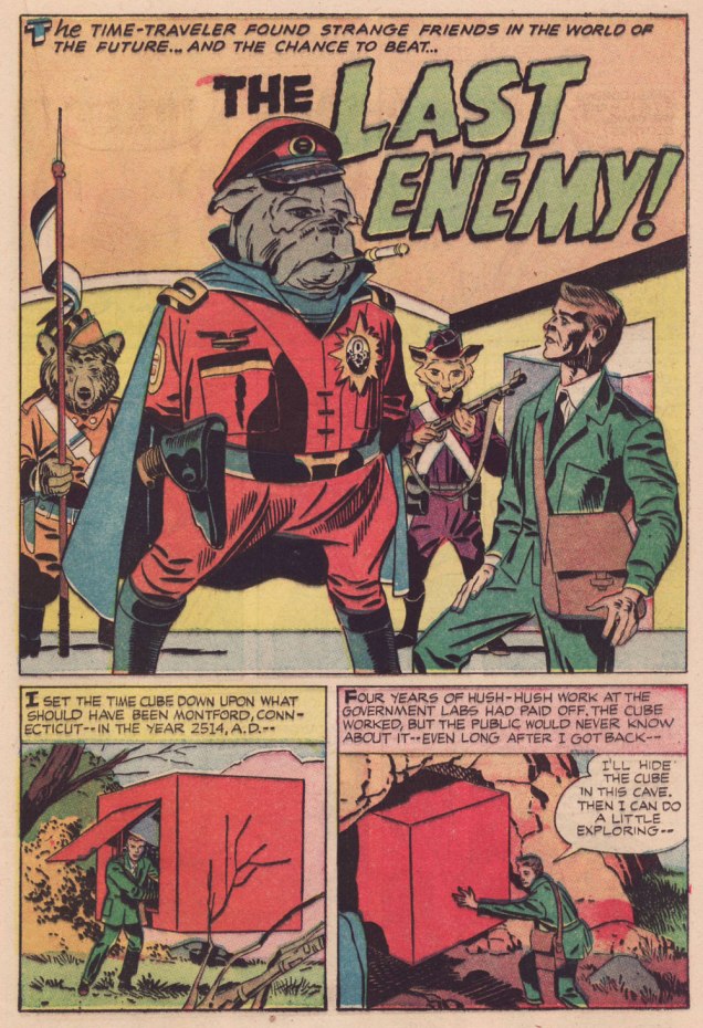
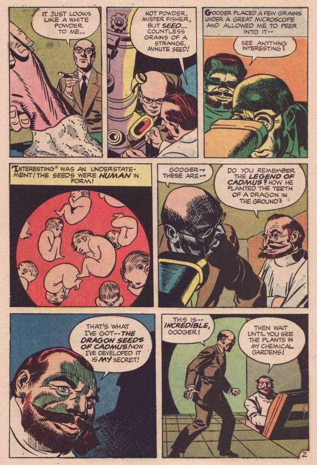
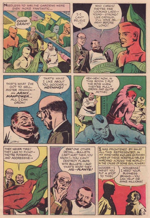
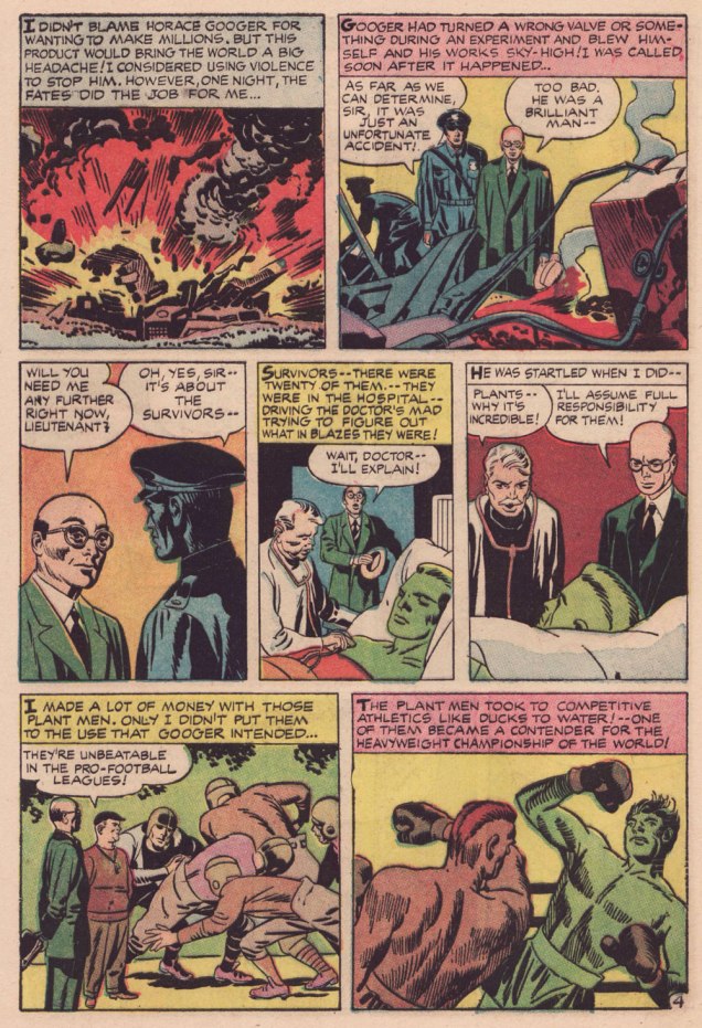
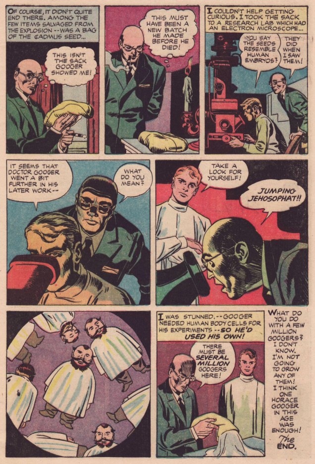
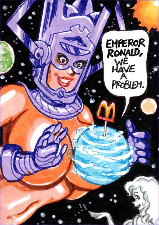
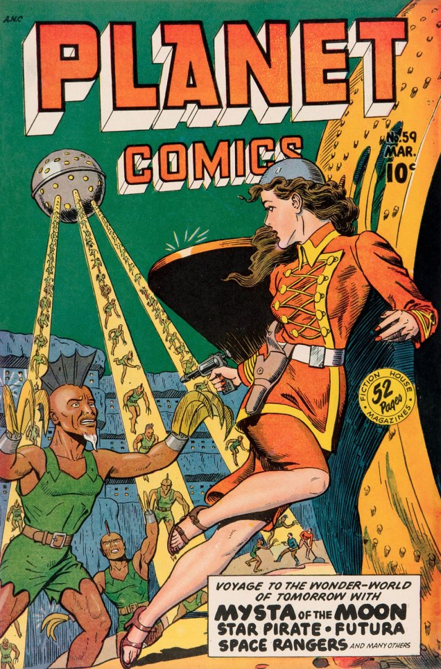
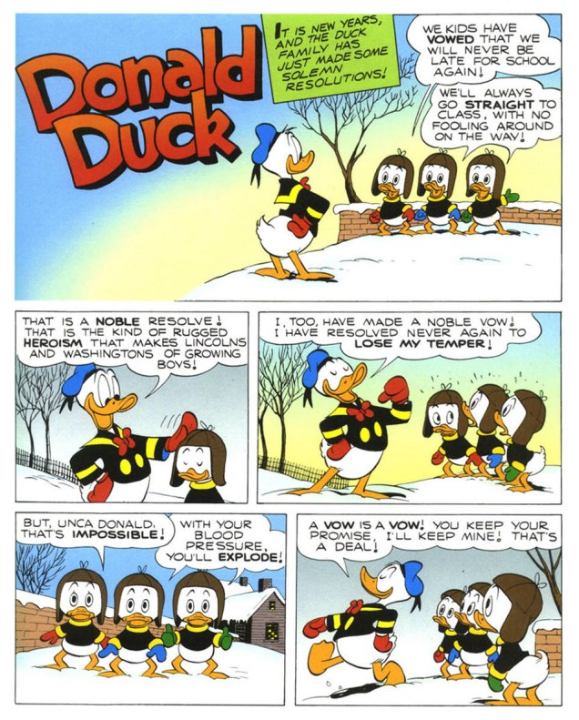
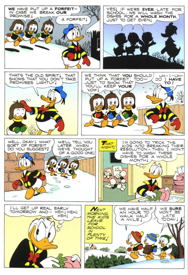
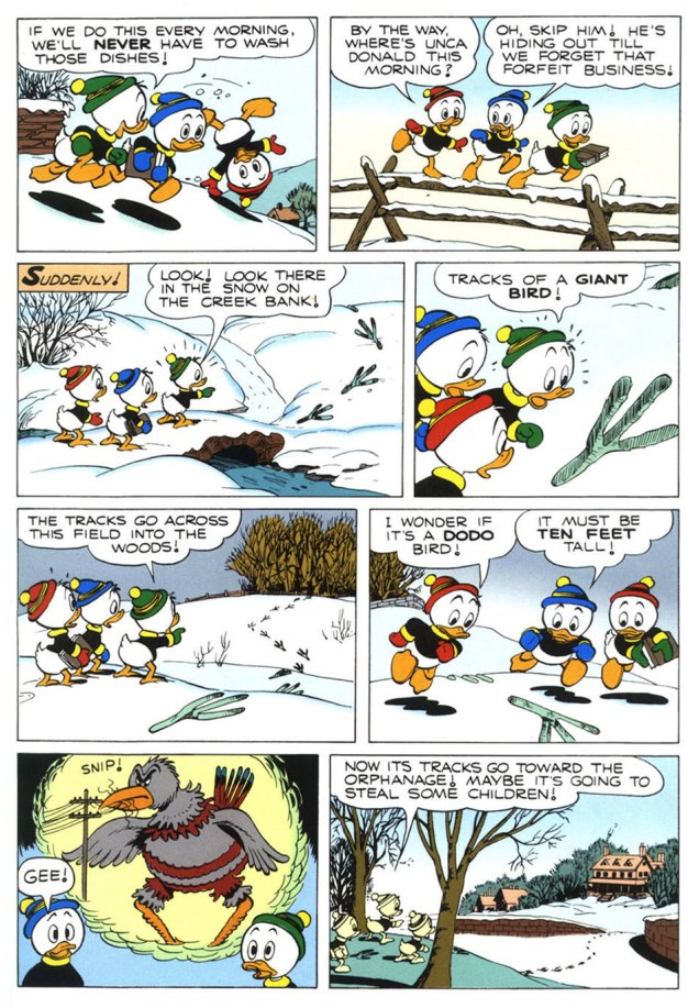
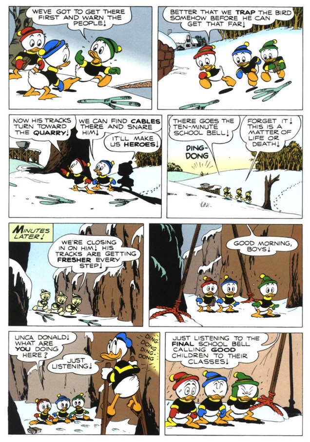
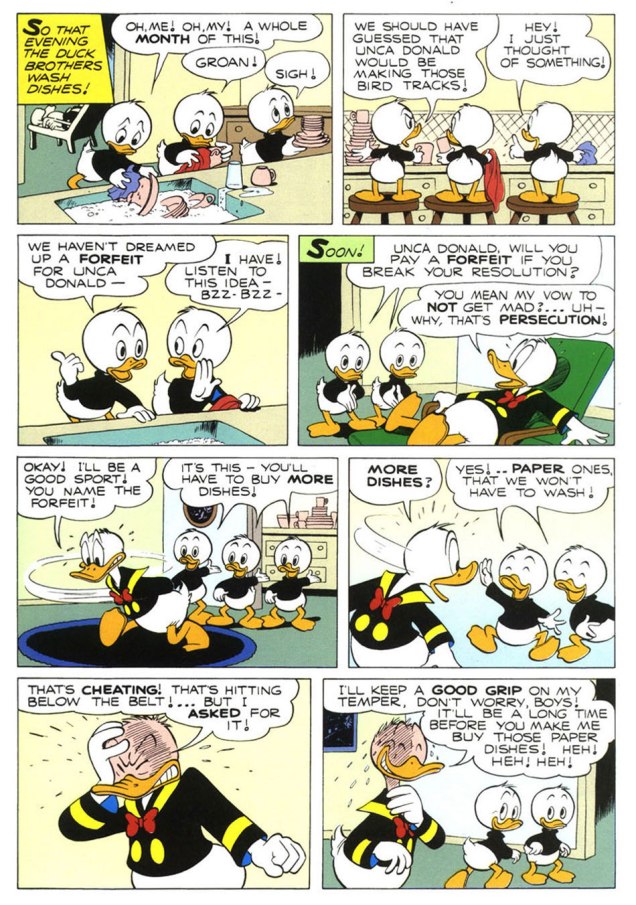
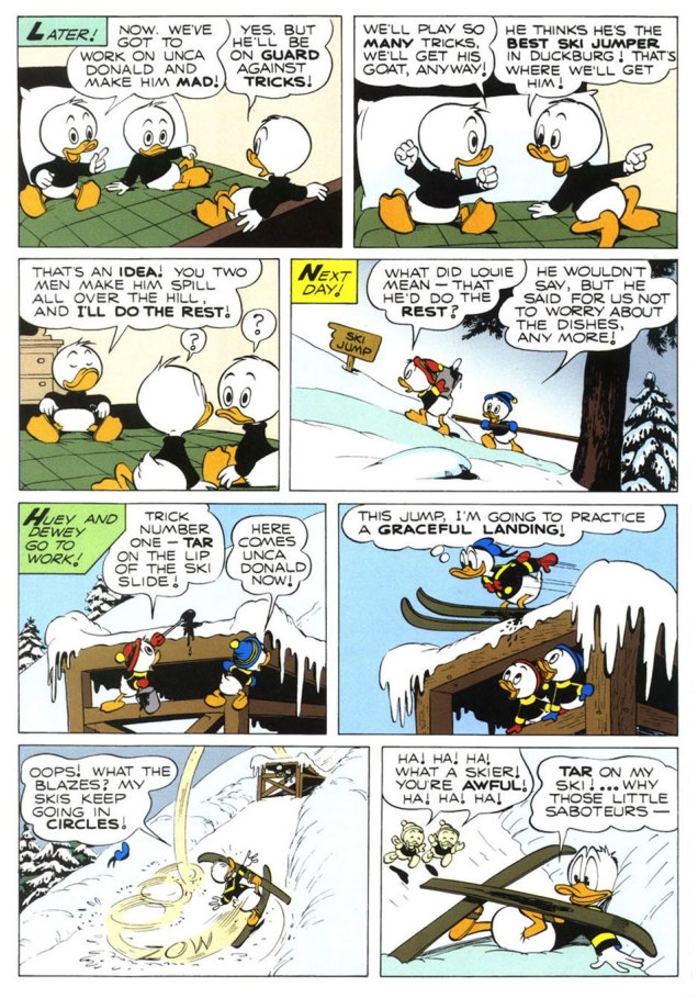
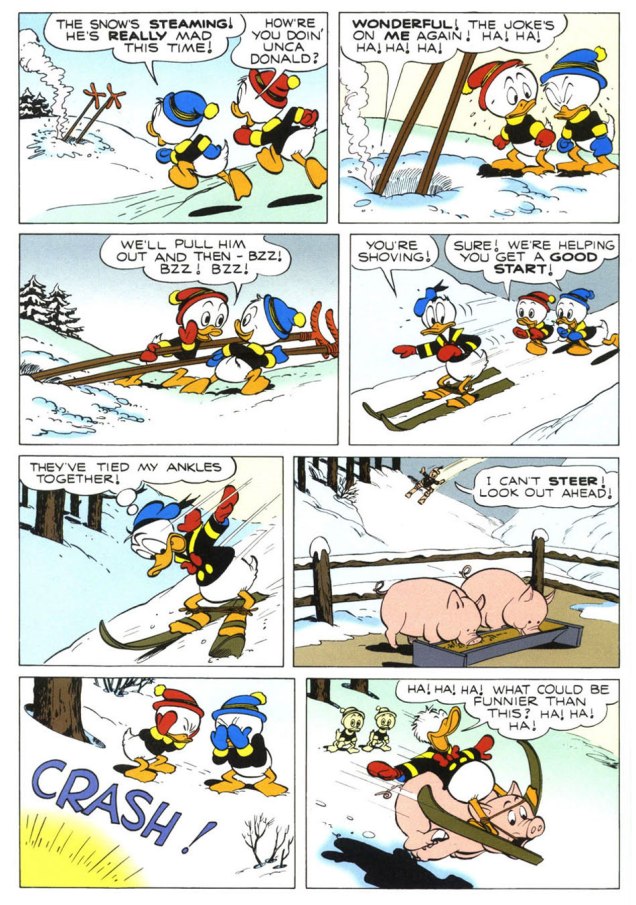
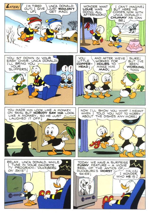
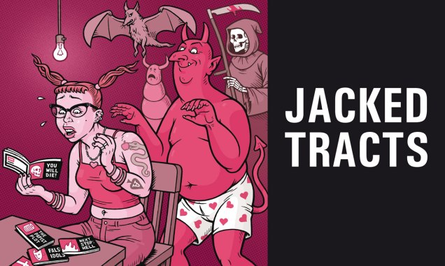
Jacked Tracts (2026) isn’t the first Chick lampoon, not by any means, but it certainly earns the distinction of being the most ambitious. Says writer-editor-illustrator-conductor Danny Hellman, as to the book’s raison d’être and modus operandi: « We took six notorious Christian comic tracts that traumatized us as children, and asked seventy-four of the world’s most depraved cartoonists to re-interpret the art, page-by-page. New text was then added to the art by this book’s editor. »
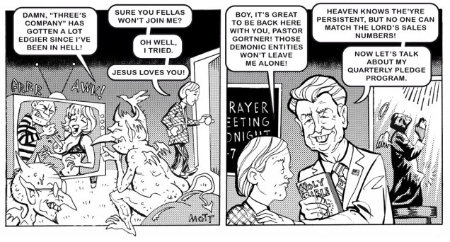
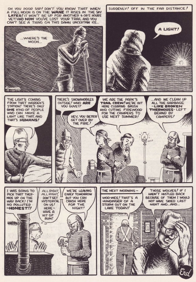
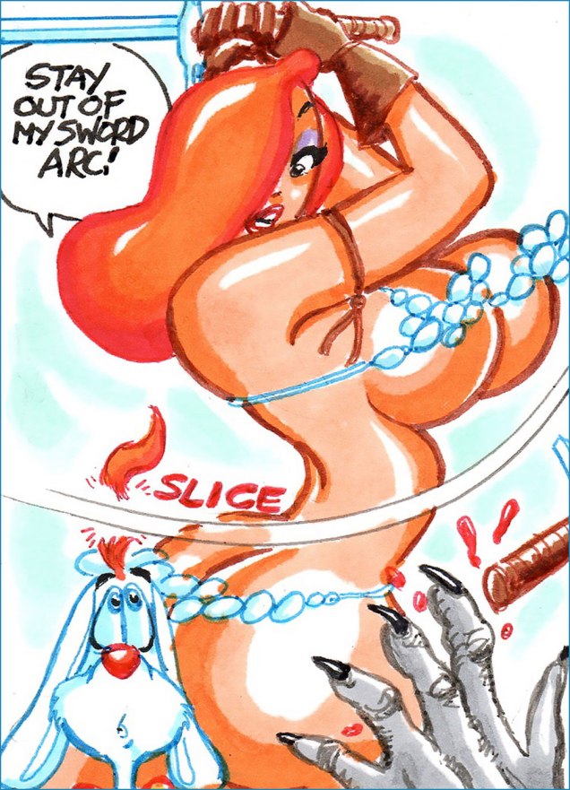
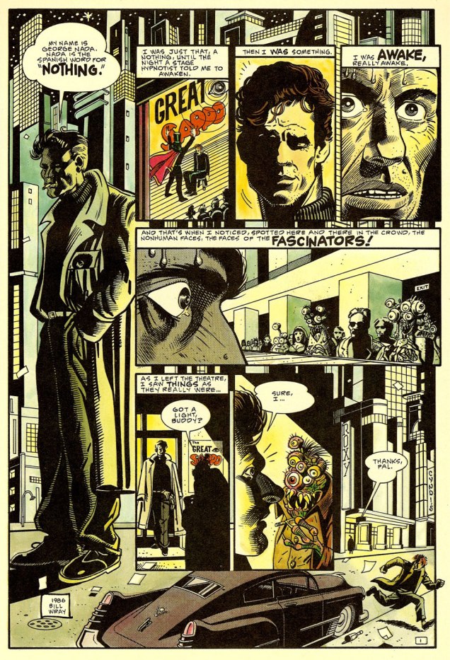
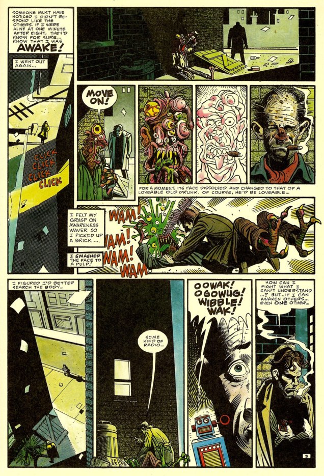
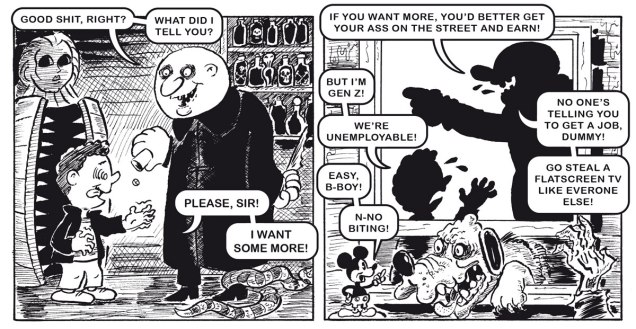
The following two pages hail from Fear the Memes, a reinterpretation of the No Fear tract.
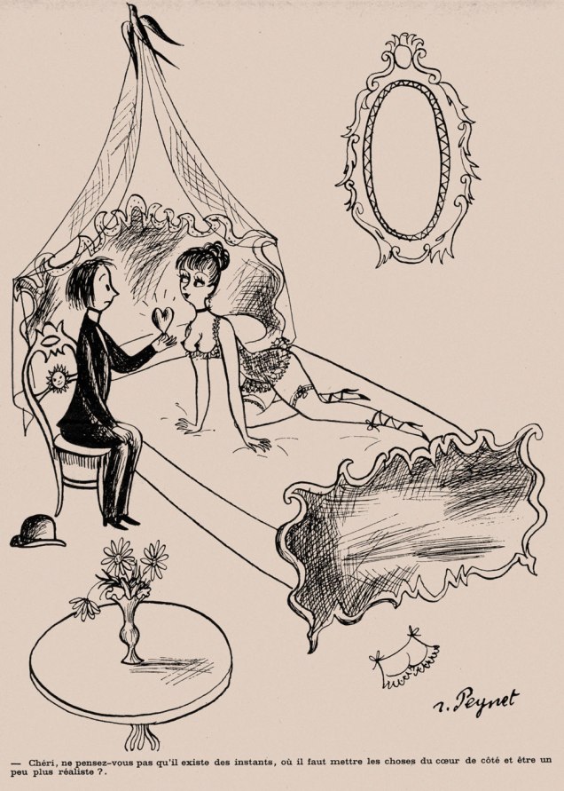
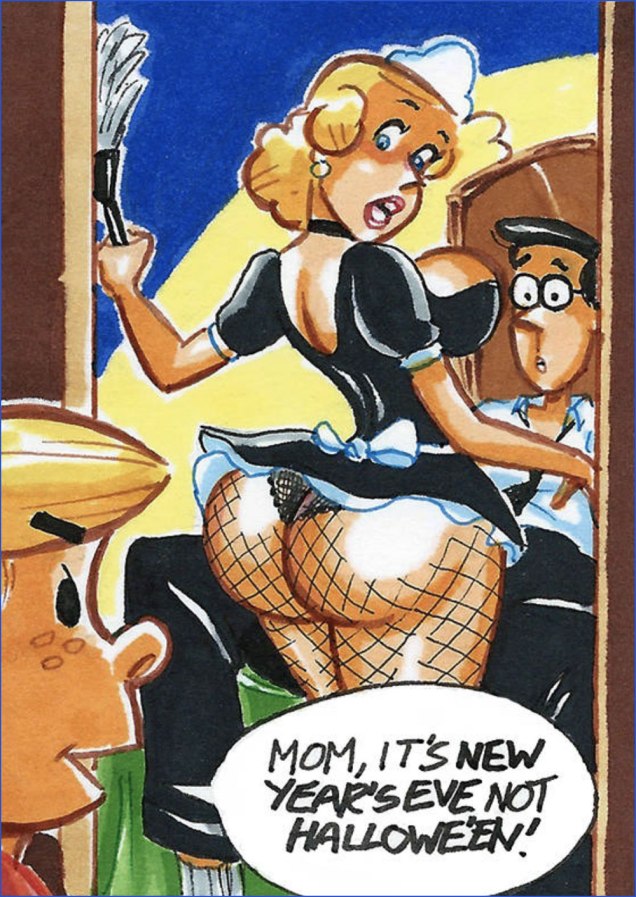
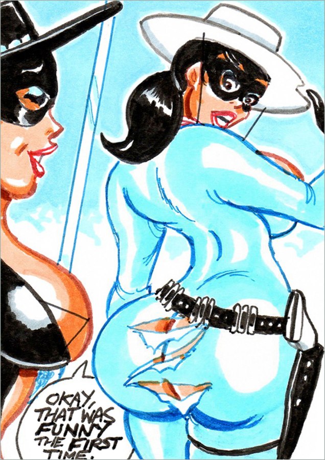
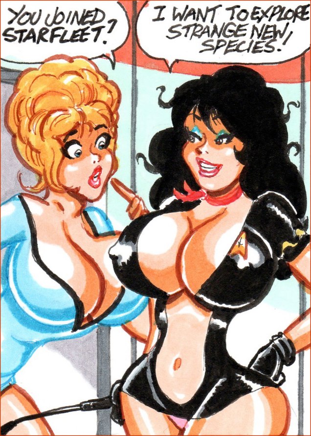
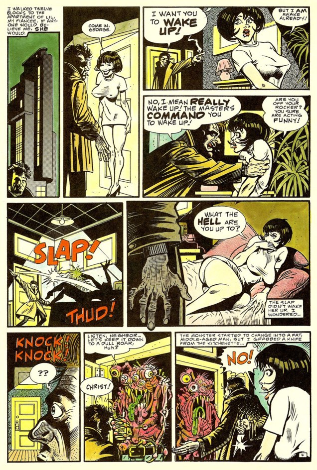
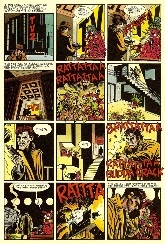
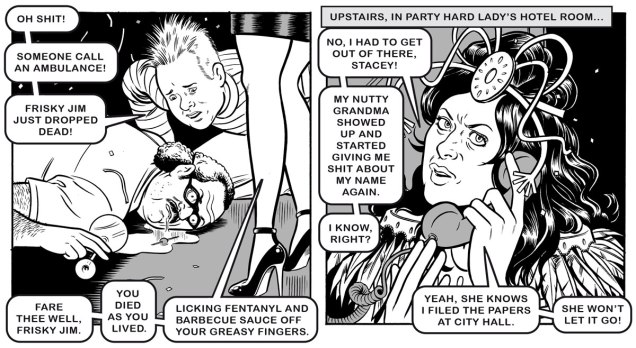
Next up, a pair of samples from Party Hard Lady, a reimagining of Party Girl.
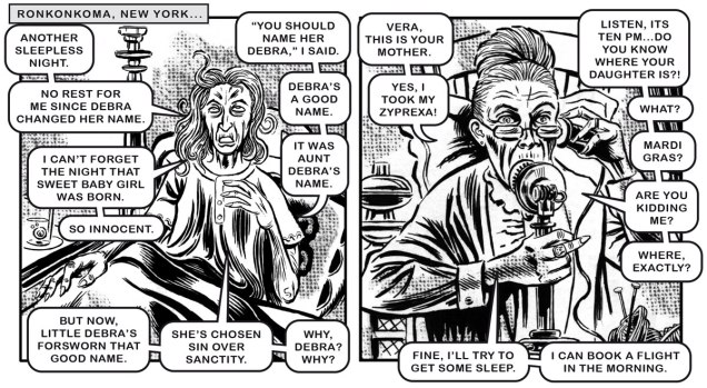
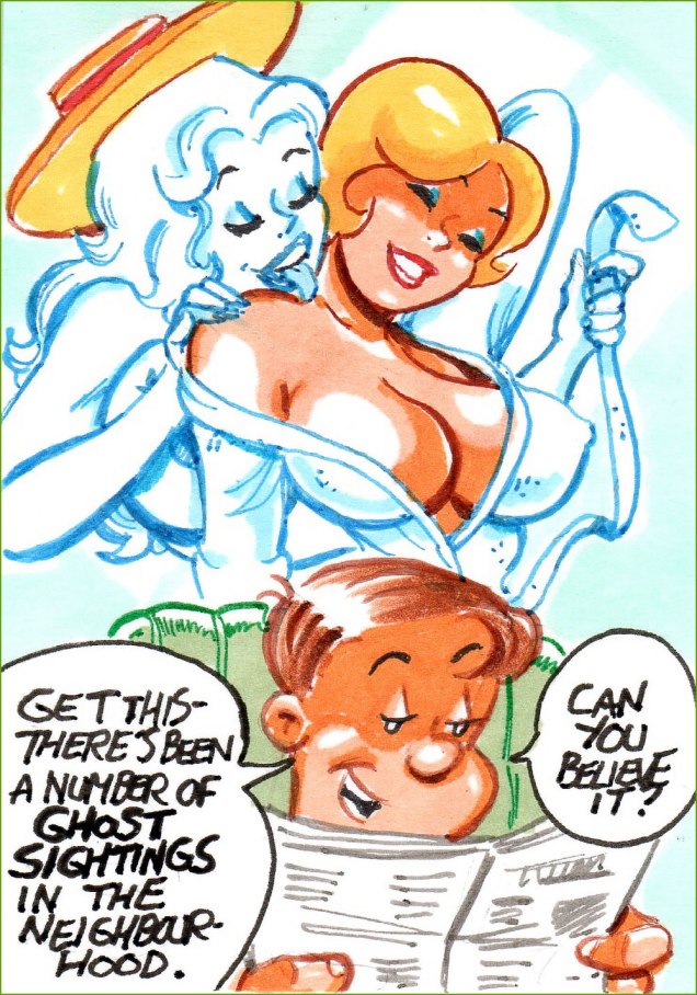
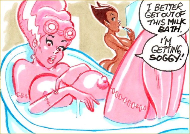
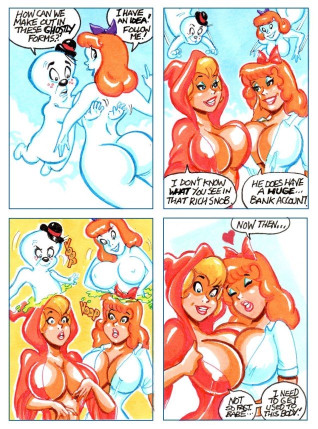
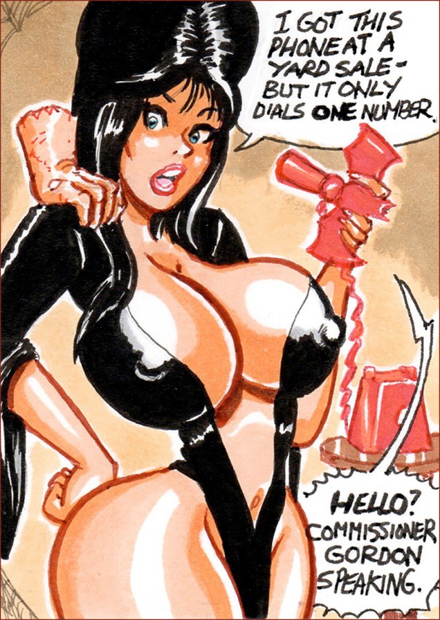
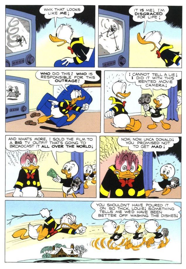
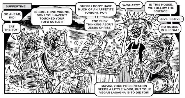
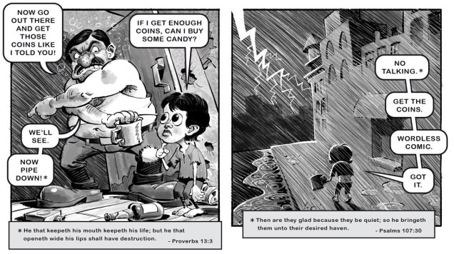
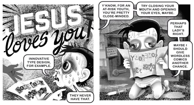
We follow up with two from a retelling of one of the most notorious of Chick’s contes cruels, Somebody Loves Me, rejigged to fine effect into Nobody Loves a Chatty Brat.
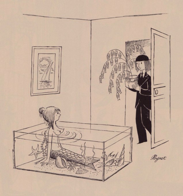
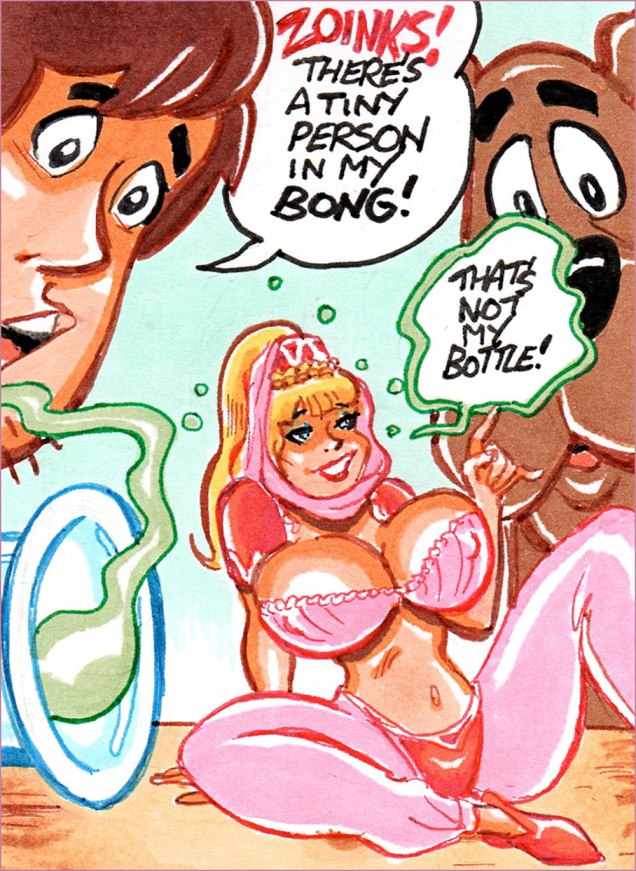
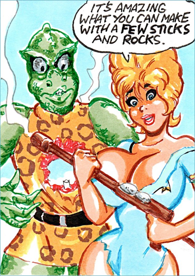
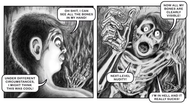
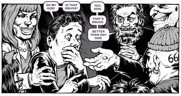
Then it’s on to the evils of drugs, with two excerpts from Trust the Pusher in the Sky, a retooling of Trust Me.
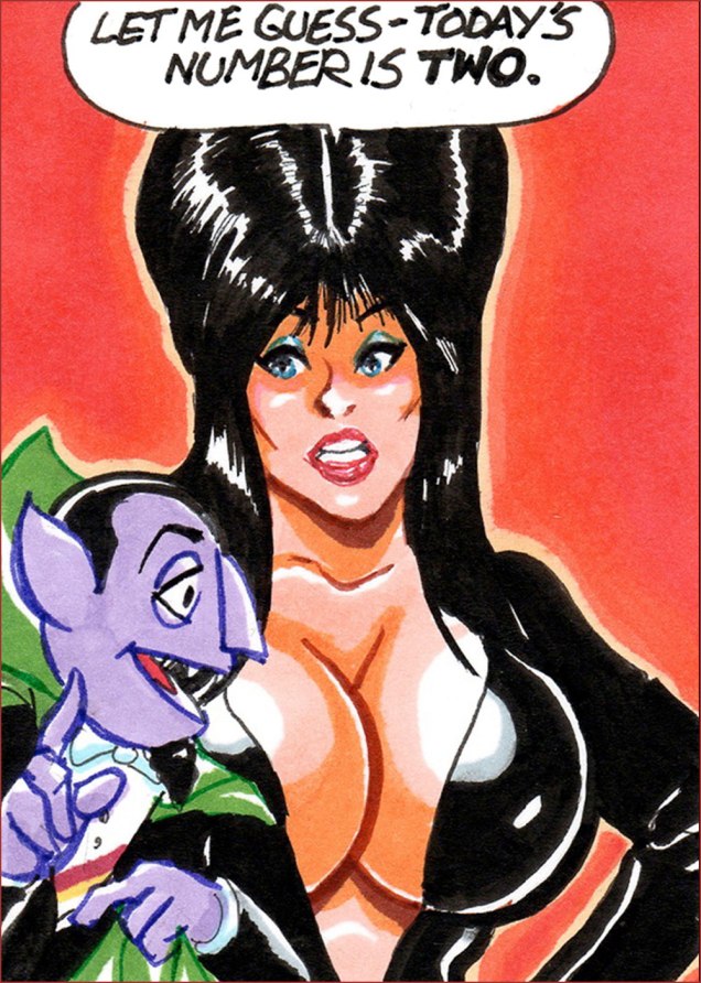
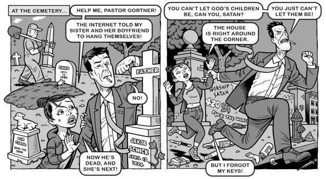
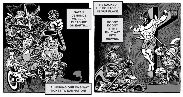
And finally, one from Mr Victor Cayro‘s solo tour de force, Boo-Boos for Beelzebub, riffing exuberantly on Chick’s Boo.
As you can surely imagine, gathering nearly seventy-five loose cannon cartoonists and shepherding this rabid flock through a project of this magnitude took — never mind the sweat and aggravation and toil — quite some time. Looking at my files, my part in it was drawn in early March, 2021… and the finished book reached my hands just last month.
Just today, while researching this piece, I came upon this quote: « … as we’re less than a year out from Itch.io’s de-listing, re-listing, and continued demonetisation of adult works affecting a number of comics creators seeking to sell their wares online, due to pressure from payment processors and conservative activist groups, and now we’re seeing the same playbook being used on Kickstarter, which is strictly prohibiting “adult-only or sexually explicit content” due to (all together now) pressure from payment processor Stripe, which itself is not exactly free from controversy. » [source]
… which in turn led me to ponder the bumpy road to publication that Jacked Tracts had. So I asked Danny.
DH: « My initial plan with JACKED TRACTS had been to self-publish, which I always find a tough slog, especially when it comes to distribution. I approached the owner of a small press to whose books I’d contributed, and asked if he’d be interested in sub-distributing JACKED TRACTS upon publication. He responded by saying he was much more interested in publishing the book outright under his imprint. After a bit of thought, I decided to partner with him. Some months later, the publisher tearfully told me he had to renege on our agreement, as other artists whose work he published had expressed objections to being in the same imprint with me. Presumably these folks objected to my heterodox politics, although with these sorts of whispering campaigns, it can be hard to know what they’re actually about. I then fell back on my original plan: self-publishing and crowdfunding. »
Danny reportedly has copies available. Just follow this magical link to doom and perdition. What have you — immortal soul aside — got to lose?
-RG
*And speaking of Canada: some Americans have mocked my fair country for banning Chick tracts for being hate speech. Dan Raeburn evidently agrees with that characterisation, stating that « … they are nothing but sanctified hate literature. » There was, for instance, this disingenuous hatchet piece in The Washington Post (remember the WP?)
It’s hard to miss the irony of this jingoistic finger-wagging from the country that repealed its Fairness Doctrine. How’s that worked out for you, guys?
“In Canada,” said Ron Cohen, chairman of the Canadian Broadcast Standards Council, “we respect free speech but we don’t worship it. It is one thing we value, but not the only thing.“